Japanese version is available here:
https://www.the-n.jp/column/edogawa-indian-restaurant-difference-visibility/
*This article does not deny the quality of your food or the effort you put into your restaurant. In Edogawa Ward, there are many restaurants, and for first-time customers it often becomes a situation where “the differences are hard to see.” From the perspective of “how to help your appeal be understood correctly,” this article organizes how to present and communicate information.
“I’m confident in the taste, but new customers don’t increase”—this is a common concern, especially in densely packed areas. In conclusion, rather than “differentiation” as a fight against competitors, what matters more is designing “how you get chosen (selection design)” so that people feel “this place fits me.” In this article, we focus on Why (why it happens) and What (what to make visible), and we’ll connect the concrete operational steps to existing related articles.
It’s not that there are “no differences”—it’s that the differences aren’t visible
Key point of this section
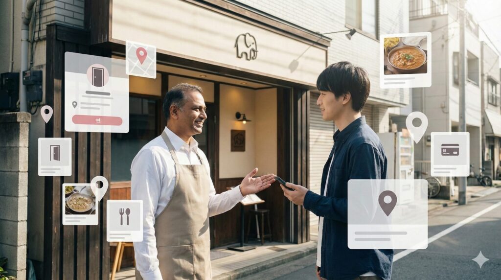
Differences in taste and experience are understood after visiting. But what gets compared before visiting are photos, explanations, price feel, how to enter, and other “reassurance cues.”
The goodness of food is something you truly understand only after you experience it. But first-time customers naturally don’t want to “make a mistake,” so before visiting they tend to choose restaurants with more “reasons to feel safe.”
What matters here is not which restaurant is better in taste or technique, but how information is designed before the visit. Even with the same “curry and naan,” simply adding an explanation that first-timers can imagine can change it to “this place seems safe.”
- ■
Exterior photos that clearly show the entrance (no confusion) - ■
A sense of the seating atmosphere (easy to enter) - ■
Price feel, spice level, and payment are clear (less chance of “messing up”)
Why it’s easy to look “the same” in Edogawa (market structure)
Key point of this section
The more options people have, the more easily similar information gets judged as a bundle. The problem isn’t “the same”—it’s that differences get buried.
The more choices there are, the more “similar information” gets judged together
In areas with many restaurants, comparisons happen easily. When comparing, restaurants with similar information are likely to be seen as “a group where the differences aren’t clear,” which can make them less likely to be chosen.
Especially on Google Maps (Google Business Profile), users compare multiple restaurants in a short time. The more elements look the same, the more it becomes “anywhere is fine,” and in the end it often comes down to distance, number of reviews, and the impression of the price range.
Comparison axes on maps easily end up looking similar across restaurants
- Food photos look similar (often centered on curry + naan)
- Menu names end with only proper nouns (hard to imagine for first-timers)
- “Reassurance information” like entrance, interior, seating, payment is thin
The key point is: this doesn’t mean “the food is the same.” In many cases, there is real taste and individuality, but because the pre-visit information looks similar, first-time customers can’t see the differences—this mismatch is what happens.
Stronger than “differentiation” is “selection” (getting chosen by the right people)
Key point of this section
Rather than “better than other restaurants,” it’s easier to be chosen when “fits me” is communicated. The shortcut is to decide first “what kind of people this restaurant fits.”
Differentiation tends to become a battle of constant comparison with competitors. In a dense market, it’s often easier to lower the barrier for first-time visits by creating a state where people feel “this place fits me” (selection).
For example, what first-timers want is not “the most amazing restaurant,” but “a restaurant they can choose with confidence.” When you can design this, it becomes easier to step away from the comparison arena.
Examples of selection (it comes across just by stating it clearly)
- “So first-timers won’t get stuck, we provide 3 popular items and a spice-level guide.”
- “We have seating where families with kids can relax.”
- “We have a counter / set options that are easy even for solo diners.”
Premium-level part: a one-page “canvas” to make your differences visible
Key point of this section
Just fill in the table below to decide your “communication axes.” When you apply what you decide to photos, menu descriptions, posts, and review replies, it becomes easier for people to see the differences.
It’s OK to start by simply “filling it in.” When you apply what you decide here to photos, menu descriptions, posts, and review replies, it becomes easier for people to understand your differences.
| Item | Fill-in field (example: copy-paste and fill as-is) |
|---|---|
| ① First-visit anxieties | Among entrance / ordering / spice level / price / payment / atmosphere, what tends to cause the most anxiety is “____” The information that removes it is “____” |
| ② Who it fits (3 types) | 1) For ____ (example: first-timers) 2) For ____ (example: spicy-food lovers) 3) For ____ (example: families) |
| ③ Recommended for first-timers (3) | 1) ____ (reason: ____) 2) ____ (reason: ____) 3) ____ (reason: ____) |
| ④ Photo order to communicate | Exterior (entrance is clear) → Entrance → Interior (seating) → Food (signature) → Menu (prices readable) |
| ⑤ Short descriptions (15–25 characters × 3 lines) | 1) ____ (example: Spice level adjustable,安心) 2) ____ (example: Set options for first-timers) 3) ____ (example: Easy to enter even alone) |
Questions for the owner (this is where it gets stronger)
- Where is the “evidence” that helps first-timers feel safe written right now?
- What kind of people does your restaurant fit? Can you say it in one sentence?
Restaurants that don’t look “the same” aren’t doing flashy things
Key point of this section
Instead of “flashy differentiation,” the trick is to remove anxieties first. When reassurance becomes visible in the order of entrance → ordering → avoiding failure, first-time visits tend to increase.
Remove entrance anxiety first (instant reassurance)
Just by showing information that reduces hesitation first—exterior, entrance, seating atmosphere, cleanliness, payment methods—the barrier to a first visit goes down.
- ■
Place an exterior photo “where the entrance is clear” at the very top - ■
Include photos that show the seating vibe (for families / for solo diners) - ■
Add a “one-line” note about payment methods and the ordering flow
Remove ordering anxiety first (the menu’s main role is “explanation”)
Rather than renaming dishes, just adding a “one-line helper” that first-timers can imagine makes it easier to choose (examples are covered in detail in another article).
Examples of one-line helpers (menu names can stay as-is)
- Butter Chicken: mild and easy to eat
- Keema: rich minced-meat flavor, great with naan
- Spinach-based: creamy and less spicy
Remove “failure” anxiety first (reviews and posts are proof of trust)
Replying to reviews and posting updates builds trust that “this place is run sincerely,” more than it’s about the ups and downs of ratings. It’s important to set it up in a way you can keep doing.
Especially for first-time customers, more than the score itself, they read the atmosphere from “the tone of replies” and “consistency of posts.” “Is this a place I can go to with confidence?” is being judged here as well.
What to do next (detailed steps in related articles)
Key point of this section
Now you’ve decided “what should be made visible.” Next is simply to organize it by “the order to do it.” The detailed steps are summarized as checklists in the related articles.
- ■
Google Maps (MEO) customer acquisition: How to rank higher with Google Business Profile and reviews:
Read the related article here - ■
How to change menu names into words that resonate with Japanese customers:
Read the related article here - ■
6 phrases that help first-time customers feel safe to enter:
Read the related article here - ■
For owners delivering “authentic flavor”: design and translation methods loved by Japanese customers:
Read the related article here
Summary: In dense areas, “reassurance” gets checked first
Key point of this section
In dense areas like Edogawa, before the battle of taste, there is a battle of “reassurance.” Rather than flashy differentiation, designing “to be chosen by the right people” is the shortcut.
In areas with many restaurants like Edogawa, it’s not that there are “no differences,” but that “differences are hard to see.” The way to win is not flashy differentiation, but “designing how you get chosen” so that people feel “this place fits me.” Start by filling in just one “visibility canvas.”
Frequently Asked Questions (FAQ)
Q. What should I change first for the fastest improvement?
A.
Start with information that reduces “entrance anxiety.” Just having photos that show the exterior, entrance, and seating atmosphere—and a one-line note for first-timers—can change how easily you’re chosen.
Q. Is it OK to use the phrase “authentic flavor”?
A.
It’s not that using it is a problem—what matters is placing it together with “information first-timers can imagine.” Adding cues like a spice guide, how easy it is to eat, and first-visit recommendations makes it easier to understand.
Q. We have a big menu, and first-timers get overwhelmed.
A.
First, decide only “3 recommendations for first-timers” and place them where they’re visible. It’s not about reducing choices—it’s about building an “entrance path” for decision-making.
Would you like to fill in the “visibility canvas” together?
the N can support restaurants in Edogawa by organizing
“Photos × Google Maps (Business Profile) × Web flow”
all together.
Let’s build the fastest path to a state where your appeal is communicated correctly.
If you’d like to “check the plan first,” please also see
Small-Start details
.
Or feel free to contact us via Instagram DM (@the.n.sns).
[Communication note]
This article does not intend to criticize any specific restaurant or culture. It is written based on the premise that, for first-time customers, situations where differences are hard to see are likely to occur, and it organizes ways of presenting and communicating information so that a restaurant’s appeal is conveyed correctly. While respecting the efforts and quality of restaurants, it focuses on information design before the visit (photos, explanations, and customer flow) to reduce anxiety.
I am not a fluent English speaker, and English is not my strong skill.
For meetings or detailed discussions in English, we will mainly use translation tools (including AI-based translation).
Because of this, there may be cases where communication is not conveyed 100% perfectly.
However, I will always take time to confirm details carefully, ask follow-up questions when needed,
and make sure we reach a shared understanding before proceeding.
Please feel free to use simple English.